Intelligence · Data Flow Mapper
See where your PHI actually goes.
Visual map of every place PHI flows in your practice. Vendors. Systems. Workforce. Find concentration risk before it concentrates into a breach.
HIPAA mapping
What this satisfies in the Security Rule.
4 citations, each with the specific Data Flow Mapper behavior that satisfies it. The mapping is the receipt — what you can show an auditor without assembling anything new.
§164.308(a)(1)(ii)(A)Risk analysis
Identifies and documents threats to PHI. The map is the data-flow documentation that supports rigorous risk analysis.
§164.308(a)(1)(ii)(B)Risk management
Identifies highest-risk paths and supports prioritization of controls.
§164.312(b)Audit controls
Visualizes the systems generating audit data; useful for understanding audit scope and coverage.
§164.502(b)Minimum necessary
Shows where minimum-necessary boundaries are working and where they aren't — PHI flowing to nodes that don't need it surfaces in the map.
What it does
The data architecture you keep saying you need to document.
When auditors ask “where does your PHI go?” most practices struggle to answer comprehensively. The EHR is obvious. The billing service is usually remembered. The transcription provider, the lab interface, the secure email service, the backup vendor, the IT contractor with access — each is remembered piecemeal. The complete map is rarely written down. The complete map is exactly what the §164.308(a)(1)(ii)(A) risk analysis requires.
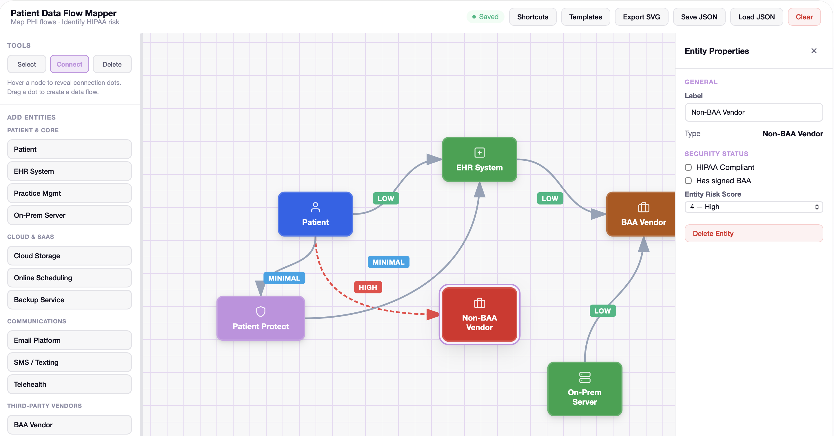
Data Flow Mapper is the complete map. The platform reads from your Workforce, your Information Systems inventory, your BAA records, your messaging history, and your form workflows to produce a visual representation of where PHI actually flows. Concentration risks (single vendors carrying disproportionate data exposure) are highlighted. Path analyses show how PHI gets from intake to disposition.
The map updates as your platform state updates. Add a vendor; the Mapper reflects them. BAA goes Active; the protection status of edges to that vendor updates. Workforce member's role changes; their access pattern in the map shifts. The map is always current state.
How it works
6 mechanisms keep Data Flow Mapper working.
Comprehensive entity discovery.
The Mapper reads from across the platform: Workforce module (internal staff, business associates), Information Systems (devices, cloud services, software systems), BAA records (the contractual relationships), messaging history (actual exchange patterns), form submissions (data capture), audit log (actual access patterns).
Multi-dimensional edge analysis.
Edges between nodes carry multiple dimensions: direction (which way does data flow), encryption status (TLS, at-rest), BAA coverage (active, expired, none), frequency (high-volume, medium, occasional), data category. The visualization can filter by any dimension.
Concentration analysis.
Nodes are sized by data exposure. The vendor handling the full patient roster appears larger than the contractor with incidental access. Concentration warnings fire when a single vendor's exposure exceeds threshold; the warning is the beginning of “should we have a backup vendor for this function?”
Path traversal.
Click “patient intake” and watch PHI flow from the intake form through the patient record, into clinical documentation, out to billing, out to lab interfaces, out to transcription. The path traversal is the answer to “what happens to PHI from the moment a patient walks in.”
Compliance-flag overlay.
Toggle compliance overlays: BAA coverage status, encryption coverage, audit coverage, role-scope coverage. Each overlay highlights the gaps in that specific dimension. The map becomes a heat map for the specific compliance question.
Export for SRA documentation.
The map exports as PDF for SRA documentation, as CSV for analysis, and as a visual asset for board reports or auditor presentations. The exported version captures current state plus the specific filters applied.
Who this is for
Built for the practices that need it most.
Practices that have done an SRA but couldn't actually show flows.
Most SRAs include a “data flow” section. Most practices answer it with a paragraph of prose. The map is the visual that the prose was supposed to summarize.
Practices with vendor concentration concerns.
If you've ever wondered whether you're too dependent on a single vendor — for data, for risk, for operational continuity — the Mapper visualizes the dependency.
Practices preparing for SRA renewal.
The annual SRA refresh is far less work when the data flow documentation is auto-generated and current. Compare to last year's map; document what changed.
Practices recovering from a vendor incident.
Post-incident, the question is “what was the blast radius?” The Mapper shows what data the affected vendor had, who else they handed it off to, and what's downstream of the affected node.
Connected to
No module is an island.
Data Flow Mapperworks because it's connected. Every signal feeds another module; every closure becomes evidence somewhere else.
Defense layer
Vendor Risk Scanner
Vendor data from the Scanner populates the vendor nodes in the map; vendor risk scoring is reflected in node visual treatment.
Learn moreDefense layer
Breach Simulator
Flow paths inform scenario step-by-step traversal; the simulator uses the map's data structure.
Learn moreIntelligence layer
Financial Exposure Tracker
Exposure calculations weight by node size from the Mapper; larger flows produce larger potential exposure.
Learn moreWhat you get
6outcomes you'll feel in week one.
The complete map.
Every PHI flow, visualized.
Concentration risk visibility.
Single-vendor concentrations surface as visually prominent nodes.
Compliance-overlay analysis.
BAA, encryption, audit, scope — see gaps in any dimension.
Path traversal.
Watch PHI flow from intake through every downstream step.
SRA-ready export.
§164.308(a)(1)(ii)(A) data-flow documentation auto-generated.
Historical comparison.
What changed since last review.
How does the Mapper know about my data flows?
What about flows that aren't on the platform?
Can I share the map with consultants or auditors?
How accurate is the concentration analysis?
Does the map show specific PHI?
What about HIPAA's “data inventory” requirements?
Continue exploring
Related features in the platform.
Defense
Vendor Risk Scanner
Evaluates every business associate against your current standing. The vendor risk picture stays current as your BAAs and their behavior do.
Learn moreDefense
Breach Simulator
Run real attack scenarios against your real configuration. The simulator shows where a phishing event, ransomware, or insider threat would land — given your actual controls and gaps.
Learn moreIntelligence
Financial Exposure Tracker
Models penalty exposure from your specific gaps against actual enforcement patterns. Compliance translated into the language boards and owners actually plan around.
Learn moreNext step
The complete map of where your PHI actually goes.
Most practices generate their first complete map inside the first hour after their SRA. The annual SRA refresh becomes a diff, not a project.
No contracts. No consultants. Starting at $39/mo.